Showing posts with label Online design. Show all posts

Thursday, January 2, 2014

Having some fun with Online design...

http://www.greigedesign.com/ 

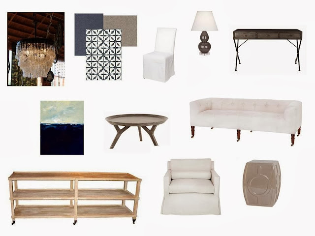
As we go into the New Year I always like to take a look back at what I have been doing in design.  I had the pleasure of working with some really wonderful clients over the past year and I do hope that this year will be equally full of them!  Here are a few idea boards for a client that is pretty much on my page all the time.  You gotta love that!  

So if you are in need of a little or big makeover for 2014 we are always here for you!

 http://www.greigedesign.com/

http://www.greigedesign.com/


Photobucket If you would like help creating inspirational spaces for yourself contact us!
+

Friday, September 28, 2012

Masculine & transitional...


A little inspiration for a Friday.  This is an inspiration board from my presentation this week.  I fell for the easy semi masculine feel of this one.  I hope you have a wonderful weekend and thanks for sharing a little bit of your day with me here, it is so nice to be able to share my work and ideas with everyone.

Photobucket 
+

Wednesday, May 23, 2012

Master bedroom design


I had the recent pleasure of designing a wonderfully large master suite for one of my clients.  This is a fantastic space and her taste is really great with a mix of transitional pieces and modern accents.   I love spaces like this that allow for a great collected look even when the pieces are brought together at the same time.  It allows you to add in details and mix it up with vintage and new accessories.

Our inspiration came from some of Darryl Carters work which I love.


Photobucket


+

Wednesday, April 18, 2012

Dining room design


I have been catching up on my design projects finally...  here is a lifestyle board for a dining room we have been working on.  Something with a stylish eclectic feeling.  

Happy Wednesday!  
Photobucket 
+

Thursday, April 5, 2012

Teen Bedroom design


I have had the pleasure of working with one of my clients on a bedroom for her 16 year old daughter.  It is really fun to see her inspiration and what she wants to do with her space.  

I wanted her to have something fun and functional with a little bit of spice to keep it interesting for her.  I suggested a large leaning bulletin board and a lot of smaller photo/art frames, as well a bright splashes of color in the rug and pillows.  

It is always nice to do something a little different!

If you are interested in our online design services you can check out some of my other projects here.


Photobucket 
+

Tuesday, September 27, 2011

Living room and Family room Design


I had the recent pleasure of working on multiple spaces for a client who was looking for a style that I really enjoy.  For their living room I suggested a clean slightly dressier look with greys and linens and to carry the feeling through into their family room we toned down the formality for a comfortable family space that will be used every day.  
In the larger family room I suggested paneling on the large open wall opposite the fire place and seating with artwork to add some weight.  It was a fun space to create.

I am always so amazed by how much fun it is to create a space for a family that they can use and the best part is getting to know my clients.


Photobucket
+

Tuesday, August 9, 2011

Feminine touch


My wonderful client Amy has given me the opportunity to work with her on another room in her home.  I am so excited!  There is a slightly feminine touch to the space with the splash of pink.  Amy has some great existing pieces that are helping to shape the direction of her space as well as some really beautiful architectural details.  

We have made some changes to her room along the way here in the design process that I think really made the design better.  That is one of the great things about designing for homeowners, I think that their needs and wants make the space easier, instead of having complete free reign.  I find that the more guidelines a space has can definitely make designing a little more challenging, but it also helps to narrow the search.  It is so much easier to design when you know what someone is looking for.  The more information a client can give about what they want and how they are going to use the space the better. 

I am loving the way that this is progressing!

Don't miss our giveaway..


Photobucket
+

Tuesday, June 14, 2011

Online design Living room project..


This is a fun little project for a client.

She was looking for something in grey and gold which is one of my all time favorite color combinations!  She wanted a space to entertain and spend time with friends so I made some smaller conversation areas within the space which can easily be moved and changed as needed.  We used some great artwork to balance the wall behind the sofa that she already had and worked in some existing pieces to create a great look.
I love the style that she was looking for and was very happy with the way it came out. 


Photobucket
+