Showing posts with label interior design. Show all posts

Wednesday, May 21, 2014

Modern Feature-Rich House In Moscow

This gorgeous example of interior design is a two story house in the village of Lake Malahovskoe, Moscow, put together by talent at Int2Architecture. The 200 square meter home explores different styles throughout each of its rooms, and each room is rich with its own visually stimulating features. Exploring this home we find inspiration for a bathroom complete with a sauna; a utility-cum-sewing room; an open plan living area comprising of a kitchen diner and lounge; unique master and guest bedroom schemes; a stylish study; a vibrant hallway design; a dual-level kids bedroom and a cool basement den.In the kitchen, a tall bank of bright turquoise units have been added to a white and gray cabinet combination, with striking results. In the foreground, we see that the lounge sofa also explores an interesting color contrast within its modules.


The entire first floor open plan scheme gathers warmth from wood clad walls, and its sharpened by shiny chrome accents. Modern patterned runners add a funky element, making the minimalist space appear fresh and fun.The space at the end of the stairs has been given function by furnishing it as an individual reading spot.This study has a striking wall mural of the world, where personal pictures from trips abroad can be displayed next to the destinations at which they were taken. 

A small lounge area has been introduced into the space to provide an opportunity to take a break from the computers, without leaving the quiet sanctuary of the work room.The basement room has a cool, grungy and slightly kitsch style–complete with a bar–that rings perfect for a man-den. The wood-beamed ceilings work great with the red brick walls and industrial furniture elements. A organized storage section is hidden away.Scandinavian design is present on the second floor, like this unique bathroom scheme.A blissfully serene bedroom scheme with light clusters and extended headboard.

Modern Feature-Rich House In Moscow Modern Feature-Rich House In Moscow Modern Feature-Rich House In Moscow Modern Feature-Rich House In Moscow Modern Feature-Rich House In Moscow Modern Feature-Rich House In Moscow Modern Feature-Rich House In Moscow Modern Feature-Rich House In Moscow Modern Feature-Rich House In Moscow

The ceiling height on the top floor of the home slides from 3.5 meters to 4.5 meters, which meant that a complete division of vertical space would either create some uncomfortably low ceilings or some wastefully towering rooms, so a clever mezzanine level was created in the kids room to eat up the excess.The rooms internal staircase harbors handy storage.Each aspect of the mezzanine receives its own adorable styling This bathroom uses pattern for wow factor.
+

Wide Open Plan with Interesting Elements

We love an airy open plan home scheme here at Home Designing, and this one has some particularly interesting features. This wide open space has a skeleton of raw walls and steel columns, and to counterbalance these rather industrial features the décor has been designed with small injections of color and shapely arrangements. 

On the outside of the modern home we see that the building is box-like in shape, thus the interior gains little influence from the architectural layout.In contrast, the pool decking sweeps away in a curvaceous manner, making way for a lush lawn and planting. Inside the home we are immediately greeted with pops of primary colors, within a quirky upholstered yellow seat and a bright blue sideboard.On the far wall an artistic arrangement of shelving spans the space, offering homes to all of the family’s display pieces, books, collections and treasured belongings.

To anchor the dining area in the vast unpartitioned space, a large pendant light has been fitted above the table. A huge kitchen diner takes its place over by the large windows, with units situated away from the perimeter in a freestanding fashion.Small cube cupboards extrude from the wall to create added interest amidst the maze of white shelving.The display wall turns into an entertainment wall as it reaches the sofa area, giving way to a wall mounted flatscreen TV. 

Wide Open Plan with Interesting Elements Wide Open Plan with Interesting Elements Wide Open Plan with Interesting Elements Wide Open Plan with Interesting Elements Wide Open Plan with Interesting Elements Wide Open Plan with Interesting Elements Wide Open Plan with Interesting Elements Wide Open Plan with Interesting Elements Wide Open Plan with Interesting Elements


A run of base cupboards are on hand to conceal media players, DVDs, consoles, and games. An industrial style metal staircase fits the style of the space perfectly.The master bedroom has a luxurious en suite bathroom, fitted with floating vanity units and a modern freestanding bath tub. The crisp white furniture sings against the same slate gray brickwork as is seen in the spacious living area.On the smooth bathroom vanity shelf, a chunky gray basin ties in the hue of the surrounding raw walls.A mezzanine lounge area receives another fun hit of color.
+

Bungalow Columns Explained

I am going to discuss the characteristics of typical bungalow columns. “Typical” bungalow columns do not include the wonderful, crazy, and expensive Arts and Crafts beauties that you would find in a Greene and Greene home. Unfortunately, those are outside the scope of most family’s budgets these days. In fact, I am going to have a follow-up post to discuss the best ways of building (or ordering) these today.


What is the main types of bungalow columns? The classic is the half column on a brick pier. This is seen all over the United States on most every type of bungalow. It comes in an endless variety of types, but I’ll describe the most common: a brick pier about 2’ wide (3 bricks across) topped with either a slab of concrete a turned row of soldier bricks overhanging about 2 inches over the pier. This pier would go up typically waist high or slightly lower. On top of the pier would be a tapered wood column. Not too tapered mind you, approximately 16-18” wide at the bottom and 10-12” at the top. Now you can dress this type of column up or down. A more California look might be to use rounded river stones for the base or to add clinkers (dark burnt bricks) randomly to the brick pier. You could also give the pier a slight taper or battered side. Up on top, you can have a simple square column or perhaps a pair of smaller square columns (4-6” square). Another variant would be to raise the pier to shoulder height and have an interlocking set of square beams as a type of column or a nice fat column, almost a cube.

Bungalow Columns Explained Bungalow Columns Explained Bungalow Columns Explained Bungalow Columns Explained Bungalow Columns Explained Bungalow Columns Explained Bungalow Columns Explained Bungalow Columns Explained Bungalow Columns Explained


Speaking of fat columns, you might be wondering, “Why so big?” Well, it just looks right is all I can truthfully say. But there are a few theories… Here is mine. Craftsman bungalows have always been tied to a “get back to basics” mentality. It was in opposition to the frivolity of the Victorian house. To the craftsman folks, the Victorian movement was fraudulent in that it divorced people from nature and the simple life. A craftsman home should be simple, straightforward and honest in its structure. This was most apparent in the use of materials: simple stonework, expressed wood beams, and clear-cut connections. Wood, stone, and earth. The house should sit well on the site. An architectural expression of the connection to the earth was the column. Creating a large stone base that gradually turned into a finished support for a wood column expressed this connection better than anything. So many of the first craftsman homes incorporated this battered stone/brick column device, that it became part of the lexicon.
+

Friday, March 7, 2014

going dark.. black interiors

 I keep seeing and loving the dark feeling of black walls.  I know it seems extreme but wouldn't it feel like a cocoon, and its just so simple.  


image by patrick kooiman via

 I know this last one is not black but let's be serious that floor is the best ever!!!!


Photobucket If you would like help creating inspirational spaces for yourself contact us!
+

Thursday, March 6, 2014

greige in rich texture


Texture rich is an understatement for this space.  The layering of materials makes such an impact in this tone on tone space.  I love every inch and wish I had the discipline to design my own home this way! Gorgeous!


Images via

Photobucket If you would like help creating inspirational spaces for yourself contact us!
+

Wednesday, February 26, 2014

make a room out of it...


We have been adding great new piece in the shop and I thought it might be fun to share a dining room design with some of my favorites and some new pieces.


Photobucket If you would like help creating inspirational spaces for yourself contact us!
+

Thursday, January 2, 2014

Having some fun with Online design...

http://www.greigedesign.com/ 

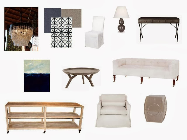
As we go into the New Year I always like to take a look back at what I have been doing in design.  I had the pleasure of working with some really wonderful clients over the past year and I do hope that this year will be equally full of them!  Here are a few idea boards for a client that is pretty much on my page all the time.  You gotta love that!  

So if you are in need of a little or big makeover for 2014 we are always here for you!

 http://www.greigedesign.com/

http://www.greigedesign.com/


Photobucket If you would like help creating inspirational spaces for yourself contact us!
+

Monday, December 30, 2013

Modern grey in Los Angeles...


We all wonder what it would be like to own a villa in California...  this would be a perfect way to keep it feeling down to earth and beautiful.  I love the clean lines, the natural light is amazing and the simple color palette makes it very appealing.


images via Veranda


Photobucket If you would like help creating inspirational spaces for yourself contact us!
+